
How Colour and Typography Shape Game Playability and Reinforce Themes
When people talk about game design, there is often a focus on mechanics. Rules, balance and replay value all matter, but how a game looks and feels plays a considerable role in whether players actually enjoy playing it.
Colour, typography and theme help shape players’ emotions, communicate information, reinforce the narrative and directly affect usability and accessibility.
For card and board games, these elements are functional tools that guide players through turns, clarify rules, and determine how welcoming or frustrating a game can feel to a newer player. When done well, players barely notice these elements, but when done poorly, they can become barriers to play.

The Impact of Colour
Colour is one of the quickest ways that a game communicates with its players. Before anyone reads a rule or takes a turn, colour can set expectations and shape behaviour. Colour theory shows that different colours influence mood, attention and decision making.
In games, this influence becomes practical rather than abstract.
Guiding Player Attention
Colour helps players to understand what matters most. Essential actions, warnings or turn indicators are often highlighted through colour to reduce cognitive load.
Warm colours such as red, orange or yellow tend to signal urgency, danger or action. They naturally draw the eye and encourage quicker responses. Cool colours like blue or green usually signal calm, safety, or passivity, making them useful for background elements or non-urgent information.
This guidance is essential for card and board games, helping players quickly scan cards, understand board states at a glance, and avoid constantly checking the rules.
Setting the Mood
Colour can help to shape emotional responses. A horror-themed game may rely on muted tones, dark contrasts or a limited colour range, while lively family games often use bright, saturated colours to signal fun and energy.
When colour aligns with the theme, it reinforces the emotional experience without explanation. Players will understand what kind of game they are playing and how seriously to take it.
When colour and theme clash, it can create confusion. A light-hearted game using overly dark colours can undermine immersion.
Accessibility and Readability
Colour choice has a direct impact on accessibility. Relying solely on colour to convey information can exclude players with colour blindness or visual impairments.
A strong contrast between the text and the background improves readability. Using icons, symbols and text labels alongside colours ensures that information is not lost for players who perceive colour differently.
When lighting conditions and table space can be limited, these considerations are even more critical. Games designed with accessibility in mind tend to be easier for everyone to play.

The Impact of Typography
Typography is often underestimated. It plays a vital role in clarity and atmosphere, carrying more than just words. It has a significant influence on how information is processed and how the game feels.
Readability and Clarity
Typography is crucial for effective communication. Rules, card text, and player aids must be easy to read quickly and repeatedly.
Illegible fonts, poor sizing, or insufficient contrast can slow gameplay and frustrate players, especially in card games where frequent reading and rereading occur.
Straightforward typography reduces mistakes, speeds up turns, and lowers the learning curve. Simple, well-spaced fonts often outperform stylised ones when clarity is paramount.
Reinforcing Themes
It also supports theme and narrative. The right font helps players feel immersed without distracting from gameplay.
A science fiction game might use a clean, minimalist sans-serif font to suggest technology and precision. In contrast, a fantasy game could employ a more decorative typeface, provided it remains readable. A historical game might reference period-appropriate styles to enhance authenticity.
However, typography can create problems when it undermines tone. For instance, a playful font in a serious game or an overly ornate font in a fast-paced card game can create dissonance. The goal is to support the game’s message, not to create spectacle.
Establishing an Information Hierarchy
Typography plays a crucial role in guiding players’ attention by creating a visual hierarchy. Font size, weight, and colour work together to highlight key actions, card names, and significant effects, making them stand out clearly.
Supporting information is readable but secondary, allowing players to process information quickly without feeling overwhelmed. This structure is fundamental in games and ensures smooth play.

The Impact of Theme
The theme provides context, giving meaning to mechanics and helping players to understand what they are doing and why. A strong theme doesn’t need to be complex but it should be consistent and clear.
Game Rule Context
A theme helps explain rules intuitively, making them easier for players to understand and remember. When mechanics align with the narrative, players learn faster and have a stronger connection to the story.
For instance, collecting resources makes more sense when tied to a specific story or setting. Similarly, movement, conflict, or cooperation feel logical when framed within a coherent world.
In contrast, without a theme, rules can feel arbitrary and disconnected from the overall experience. With a theme, they feel purposeful and contribute to the overall enjoyment of the game.
Driving Immersion
Compelling themes encourage emotional investment, making players more likely to stay engaged. When players feel part of a world, rather than simply moving pieces or playing cards, they are more likely to be immersed in the experience.
This immersion enhances enjoyment and replay value, as players often discuss games that evoked strong emotions rather than simply those that functioned well.
Cohesion and Consistency
Theme, colour and typography must work together. When these elements are consistent, the game feels polished and intentional.
Inconsistency breaks immersion.
A strong theme paired with mismatched colours or fonts can confuse players and weaken the overall experience. Cohesion, on the other hand, helps games feel intuitive and complete.
How Colour, Typography and Theme Impact Card Games and Board Games
In physical games, elements carry more weight than in digital formats. Since tooltips, animations, and automated prompts are absent, everything must be communicated through design.
Card games rely heavily on fast recognition. Colour coding, readable typography, and clear thematic cues enable players to process information quickly during play. Conversely, poor design can slow the game down and increase rule checking.
Board games often involve more components and shared spaces. Clear visual systems help players understand the state of play at a glance, reducing confusion and downtime.
Video games can compensate for weaker visual communication through sound, motion, and interface feedback. Physical games cannot. This is why thoughtful design is essential for tabletop experiences.
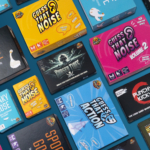
Wholesale Card Games That Consider Colour, Typography and Theme
For retailers, visually well-designed games are easier to sell and recommend. Clear layouts, strong thematic cohesion, and accessible design reduce friction for new players and increase satisfaction after purchase.
Card games that carefully consider colour, typography, and theme tend to perform better in the long term. They are more approachable on the shelf, clearer at the table, and more likely to be enjoyed across different player groups.
If you’re looking to stock card games that combine strong playability with thoughtful design, get in touch with us to discuss wholesale card game options, availability, and pricing.
First Published: December 2025
Last Edited: January 2026